3 Problems With KPI Traffic Light Dashboards
by Stacey Barr |How to create a KPI traffic light dashboard or traffic light report to highlight signals in a clear, valid and constructive way, and avoid the 3 big problems.
A traffic light dashboard or traffic light report uses red, amber and green coloured icons (also know as RAG) for each of our KPIs or performance measures. They tell us what type of attention to give to those metrics.
Visual analysis expert Stephen Few has much to say about the risks of those default colours. And I have a few things to say about risks of the meaning we assign to those traffic light colours.
In his paper Dashboard Design for Real-Time Situation Awareness, Stephen Few reminds us that the first risk of using red, amber and green as colours on any report for decision making is that 10% of the male population and 1% of the female population is colour blind.
So, they can’t distinguish between red and green. An important distinction, don’t you think, given that we usually assign these colours opposite meanings, and therefore would required completely different actions?
Stephen also points out that too much use of colour makes a dashboard (or any report) too overwhelming: we can’t discern the important things. He advises that the best use of colour is to make specific things, like measures that need priority attention, stand apart from the rest.
I agree with Stephen on both counts. And I see some additional risks too, very insidious ones that can derail our intentions to make performance better and send it pear-shaped instead.
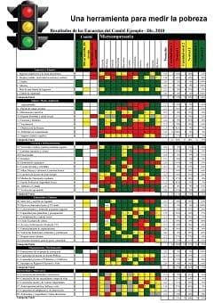
Problem #1: Rules for allocating traffic light colours to measures are inconsistently defined and used.
I’ve seen several different comparisons used as the basis for allocating green, amber or red to performance measures in traffic light dashboards and reports.
Red usually stands for unacceptable or bad performance. But the rules for deciding if a measure is red aren’t clear:
- Is it when this period is worse that the last period, or the same period last year?
- Or when it’s worse by 10% or more?
- Is it when this period is below target?
- Or when the year-to-date average is too far behind the annual target?
- Or is it when performance is trending away from the target, in the wrong direction?
Green usually stands for good performance or acceptable performance. And the rules for deciding if a measure is green are also not that clear:
- Is it when this period is better than the last period, or the same period last year?
- Or when it’s better by 10% or more?
- Is it when performance this period has met or exceeded target?
- Or something else?
What amber (or yellow) stands for is often even more ambiguous and more confusing:
- Does it stand for almost-acceptable performance, or performance that shows early signs of heading bad?
- Or does it mean that performance is almost good?
- Or that it’s not changing?
For any traffic light report to work consistently, and to help us to arrive at the truth about what performance is doing, we need very specific rules for assigning a traffic light colour (or shade, taking Mr. Few’s advice) to each performance measure.
Problem #2: Interpretation of traffic lights is rarely consistent with performance improvement.
Performance measures are supposed to guide our actions to improve performance. But the actions that traditional traffic lights trigger rarely have anything to do with fundamental performance improvement. Instead they trigger judgement.
Those who get red lights don’t feel very empowered under the glare of the spotlight as they are asked to explain why and to make sure they’re green next period. Those who get green lights for their measures feel relieved as they are rewarded with a bonus, a pat on the back, or simply the opportunity to escape the spotlight for the period.
To get the most out of our performance measures, their owners need to feel confident, curious and committed to continuously improving the processes their measures monitor. Judgement does not hold space for these more constructive emotions, and moreover pushes them out to make way for fear, anxiety, frustration and helplessness.
Be honest: don’t you see much more excuse-making, finger-pointing and symptom-treating than you do fundamental business process redesign, in response to red traffic lights?
Problem #3: Traffic light rules are statistically invalid assessments of current performance.
Traditional traffic lights lead us astray unknowingly because their rules use data in a way that draws inappropriate conclusions about performance. This month being better than last month, even it’s by more than 10%, does not mean performance is better. It does not mean that the measure needs a green light. If your measure’s values typically vary between 50 and 70 from month to month, a 10% difference is just a natural part of the normal variation.
A professional statistician would never analyse data this way. So why should anyone else do it, and claim that it’s appropriate? Statisticians study the phenomenon of variation, because everything we measure has variation. This variation is caused by a bazillion different factors, tiny and gigantic, that interact in our complex world to take full control of performance away from us. We can expect nothing to be precise and predictable and within our complete control.
This natural variation needs to be understood before we can tell if a set of data have any signals we can draw conclusions about. Further still, everything has it’s own unique pattern and amount of variation, especially performance measures. That’s what the majority of traffic light rules ignore, and thereby end up telling us to act when no action is needed, or telling us all is fine when in fact there is a real performance problem emerging.
Are there any sensible traffic light reports?
Don’t get me wrong: I’m not saying we have to accept the current amount of natural variation in our measures. In fact, performance improvement is all about trying to understand what contributes to that variation and finding ways to reduce it. The more variation we can control or manage, the better performance becomes. So we can’t ignore it or pretend it shouldn’t be there. And neither can our methods of reporting measures (if we are honest about using measures to improve performance, that is).
This is why I always use, and always advocate you to use, XmR charts. They report our measures with a full and proper appreciation of the variation our measures have. In fact, these charts quantify that pattern of variation for us. XmR charts also come with clear and unambiguous rules for signal detection, so we know exactly when performance changes and whether than change is a good one, or an unacceptable one.
So when we use XmR charts as the basis for interpreting our performance measures, we discover a much more valid and consistent meaning for traffic lights. Combine the rules for signals in XmR charts with a focus on allocating attention based on priority, and using shades of a single colour to visually highlight the priorities, we get three new traffic lights:
Priority 1 (darkest shade): the XmR chart shows chaotic performance or a shift in the wrong direction
Priority 2 (medium shade): the XmR chart is showing no shift toward the right direction – performance is static and unchanging
Priority 3 (lightest shade): the XmR chart shows a signal of performance moving in the desired direction
These three new rules can work like this in a traffic light dashboard:
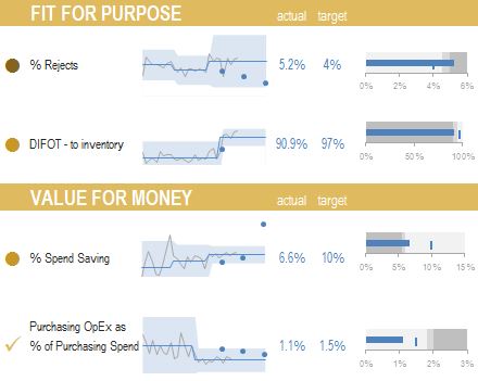
The most important measure to discuss and analyse, in the pictured sample, is % Rejects (it has the darkest traffic light or priority flag). That’s because it has shifted away from the targets (the little blue dots are a series of targets sitting above the dates we wish to reach them by). It becomes so simple and consistent, non-threatening and powerful to interpret our measures this way!
I reckon that if anyone refuses to abandon traditional traffic lights after understanding this argument, they’re simply not interested in getting real insights from their measures and taking responsibility for true performance improvement.
TAKE ACTION:
What are the rules used in your traffic light dashboard or traffic light report? Are they valid? Take just one performance measure or KPI, create an XmR chart for it, and try out the new rules. How much more insight do you get from the measure now?
Join Measure Up
Sign up for the Measure Up newsletter and get free access to the "10 Secrets to KPI Success" online course and e-book.

Upcoming KPI Training
>> North America, Online Interactive, 15-19 April 2024
>> Australia/NZ/Asia Pacific, Wellington NZ, 7-9 May 2024
>> Africa, Cape Town SA, 8-10 May 2024
>> UK & Europe, Online Interactive, 10-14 June 2024
>> North America, Online Interactive, 3-7 June 2024


Connect with Stacey
Haven’t found what you’re looking for? Want more information? Fill out the form below and I’ll get in touch with you as soon as possible.
167 Eagle Street,
Brisbane Qld 4000,
Australia
ACN: 129953635
Director: Stacey Barr