A Measurable Strategy on a Single Page
by Stacey Barr |Strategy maps, a la the Balanced Scorecard, are the most commonly used visual representation of strategy on a single page. But are they the only way to visualise a measurable strategy?
The power of strategy maps lies in their succinct and visual presentation of strategic objectives, in a way that highlights the cause-effect relationships among those objectives.
It’s a brilliant thing, to be able to see the big picture of your organisation’s strategy in one view, on a single page.
In PuMP, we use a Results Map to do this.
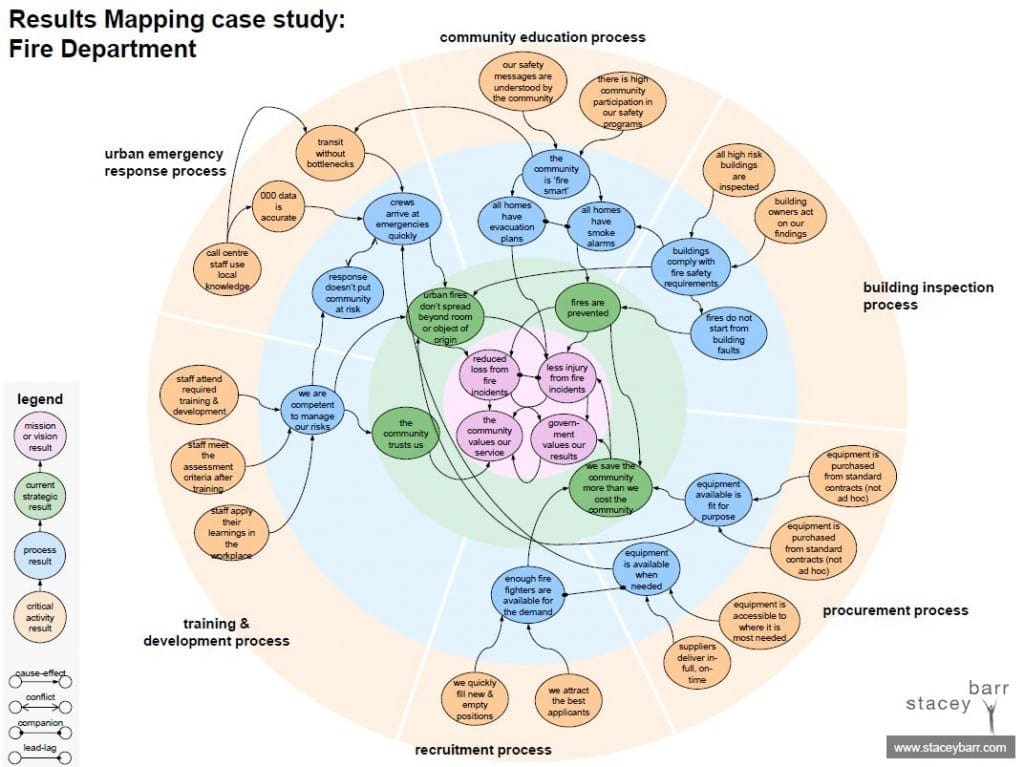
[You can get a pdf of this here.]
The zones in a Results Maps make cascading and aligning strategy easier.
There are almost always four zones in a Results Map:
- The pink zone is the middle zone. It’s where results implied by your mission and vision belong.
- The green zone is the next one out, and it’s where the results implied by your (usually weasely or vague or action-oriented) strategic plan belong.
- The blue zone is where results implied by departmental or customer-facing business process outcomes belong.
- The orange zone is where results implied by teams or business units or sub-processes belong.
These zones are arranged in a way that you can see how strategy cascades outwards from the centre, and how people can see alignment from their work through to the organisation’s purpose.
The bubbles in a Results Map are measurable performance results.
There is no place for actions on a Results Map. If you try to measure things like ‘train staff in negotiation’, you’ll just end up with a silly and trivial measure like ‘number of staff trained’.
And there is no place for weasel words on a Results Map. If you try to measure something like ‘enhance innovation’, you’ll end up with a uninformative measure like ‘number of new ideas generated’. Bleh.
Each bubble on a Results Map contains a unique performance result that is expressed as though it were a fact, like these:
- Customers are loyal.
- Delivery cycle time matches what the customer was promised.
- Employees are not harmed at work.
Wording performance results this way makes it easier to visualise the state we want to reach, and that makes it easier to find meaningful measures.
The relationships tell a fuller story than just cause-effect.
There are three relationship types on a Results Map:
- cause-effect, which means that by achieving one result, the other is more likely to be achieved
- companion, which means that both results are synergistic and need to be achieved together
- conflict, which means that acheiving one result puts the other result at a high risk of being sabotaged
Strategy is often not linear, and the Results Map allows you to tell the story of strategy more flexibly.
Performance measures are evidence of performance results.
The Results Map is the technique we use at Step 2 of the PuMP Blueprint methodology to make a set of objectives or goals measurable. There’s no point trying to measure a strategy that ain’t measurable!
When the measures for each performance result are designed, you can put them right on the Results Map to complete the story of the strategy.
Where’s Wally?
Or, if you’re not in Australia, ‘Where’s Waldo?’
One of my first Results Mapping clients nicknamed it the Where’s Wally Diagram. That was for two reasons.
Firstly, it was because the Results Map is, admittedly, quite a busy diagram on first glance. Not quite as bad as looking at a Where’s Wally cartoon, though! And you can successfully explain it in just a couple of minutes, anyway.
Secondly, and mainly, it was because once Wally was found in the map, Wally knew where he fit in the organisation. Wally had a line of sight from his work results through to the organisation’s priorities and purpose. That’s pretty neat.
You can learn how to create and use Results Maps to make your strategy measurable and easier to communicate, at an upcoming PuMP Blueprint Workshop or anytime with the PuMP Blueprint Online Program.
JOIN THE DISCUSSION:
What’s your reaction to the PuMP Results Map? Share your suggestions on the blog.
Join Measure Up
Sign up for the Measure Up newsletter and get free access to the "10 Secrets to KPI Success" online course and e-book.

Upcoming KPI Training
>> Australia/NZ/Asia Pacific, Wellington NZ, 7-9 May 2024
>> Africa, Cape Town SA, 8-10 May 2024
>> UK & Europe, Online Interactive, 10-14 June 2024
>> North America, Online Interactive, 3-7 June 2024
>> USA, Washington DC, 25-27 June 2024


Connect with Stacey
Haven’t found what you’re looking for? Want more information? Fill out the form below and I’ll get in touch with you as soon as possible.
167 Eagle Street,
Brisbane Qld 4000,
Australia
ACN: 129953635
Director: Stacey Barr