CASE STUDY: 3 Common Mistakes to Avoid With Your XmR Charts (Part 2)
by Stacey Barr |Following on from Part 1, another of the legacy habits that can sneak surreptitiously into our XmR charts and make them incapable of highlighting the real signals in our performance measures, is focusing on the wrong performance measure!
XmR charts are based on very specific and deliberate statistical theory, even though they are quite easy to interpret and understand. They are quite easy to create also, when you have the correct knowledge and procedure to build them.
Without this correct knowledge and procedure, a few mistakes creep into our XmR charts that cause them to be invalid: they don’t highlight the right signals.
MISTAKE #2: Focusing on the wrong performance measure
Brigitte works for UK-based software company that has, as we’d expect, a performance measure of the total count of High Priority Software Bugs which are logged by customers each quarter.
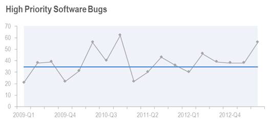
If we just look at the XmR chart of the simple count of High Priority Software Bugs, we’d see early suggestion that things are getting worse: there seems to be more bugs produced. We’d be tempted to draw the conclusion that software developers were getting careless.
But is the simple count truly evidence of software developer performance? What other factors could explain an increase the number?
Correcting this mistake…
One factor is the amount of software being developed, and another is the technical complexity of the software being developed. Both these factors could be quantified, but a quick proxy we can use is the measure of Hours Booked to Software Development.
Combining the two measures would give us a rate at which bugs are occurring that might adjust for the opportunity for bugs to occur: High Priority Software Bugs per 100 Hours.
And the XmR chart for this shows a very different story:
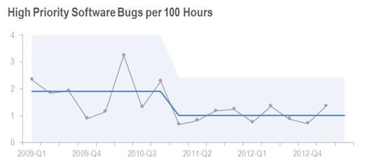
We see a definite signal – a long run below the central line – that indicates that fewer bugs are produced per 100 hours worked. In fact, it looks like the rate of bug production has nearly halved, moving from 1.9 bugs per 100 hours down to 1.0 bugs per 100 hours.
What happened in the first quarter of 2011 to produce this improvement?
It goes to show that it’s very important to be clear about the performance result you’re trying to improve, and to choose a performance measure that provides direct evidence of that result.
Perhaps High Priority Software Bugs per 100 Hours isn’t even the best measure. But until we understand the performance result that matters most, we won’t be able to know with confidence what the best measure is for us to monitor and respond to.
Coming up next is 3 Common Mistakes to Avoid With Your XmR Charts (Part 3)…
TAKE ACTION:
Do you have the right measure for your performance result? Or do you find people have lots of ‘reasons’ why performance varies, such that signals in your XmR charts are not signals about changes in performance, but signals of something else?
Join Measure Up
Sign up for the Measure Up newsletter and get free access to the "10 Secrets to KPI Success" online course and e-book.

Upcoming KPI Training
>> Australia/NZ/Asia Pacific, Wellington NZ, 7-9 May 2024
>> Africa, Cape Town SA, 8-10 May 2024
>> UK & Europe, Online Interactive, 10-14 June 2024
>> North America, Online Interactive, 3-7 June 2024
>> USA, Washington DC, 25-27 June 2024


Connect with Stacey
Haven’t found what you’re looking for? Want more information? Fill out the form below and I’ll get in touch with you as soon as possible.
167 Eagle Street,
Brisbane Qld 4000,
Australia
ACN: 129953635
Director: Stacey Barr