Storytelling With Data for Fact-Based Messages
by Stacey Barr |In storytelling with data, Data and Story are interdependent poles we need to leverage, to be sure our messages are truth.

Humans can, for the most part, absorb stories much faster and more intimately than data. Storytelling is primal. So much so, that a risk of combining data into stories is that the data’s integrity is sacrificed for the story’s sake. Yet, data without story can so easily be dry and flavourless and unmemorable.
Nick Desbarats, who I met through Stephen Few, recently wrote a great post about exactly this situation. Katie Porter was grilling a Big Pharma CEO about drug prices. And Nick was so impressed by the use of data storytelling that he missed some very important misrepresentations of the data during his first watch. His subsequent blog post shared the lesson:
If we get carried away and start crafting the data around the story instead of the other way around, great storytelling makes that harder for audiences to notice. – Nick Desbarats, Practical Reporting
Nothing is all good or all bad. Stories are not all good or all bad. Data is not all good or all bad. The power comes from using them both, in synergy, to help the truth become evident to everyone.
My PuMP Partners for Africa, Peter Ndaa and Njeri Faith, have become experts in a tool known as polarity thinking. They’re finding it useful to help people to use as a second lens in exploring other aspects of performance measurement that we traditionally see as opposing, but don’t have to be.
In this video, Njeri clearly explains the concept:
Polarity thinking therefore gives us a framework for leveraging the energy between Story and Data in a way that can help the truth become evident.
As Njeri explained in the video, it starts with thinking through the downsides and upsides of both story and data, in the context of making truth evident. Then we think through the indicators and actions for the downsides of both story and data. And it might come together to look like this:
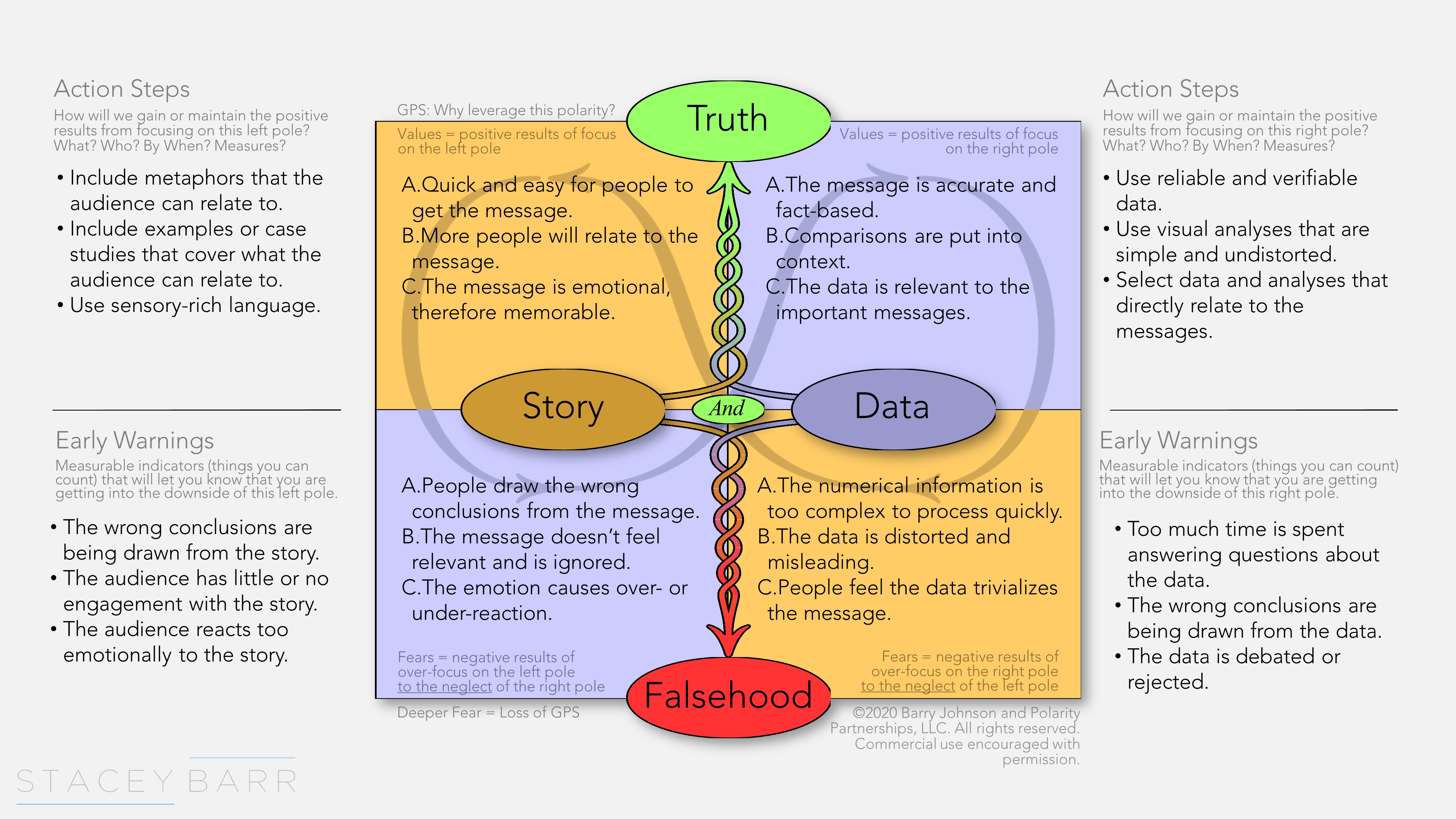
The ideal is that Data gives accuracy to Story, and Story gives life to Data. And a Polarity Map, like the one above, helps us to incorporate the upsides of both Story and Data when we want to design a fact-based message that everyone will resonate with, and take appropriate action from.
Data and Story are interdependent poles in a relationship we should leverage when we share a fact-based message.
[tweet this]
Join Measure Up
Sign up for the Measure Up newsletter and get free access to the "10 Secrets to KPI Success" online course and e-book.

Upcoming KPI Training
>> Australia/NZ/Asia Pacific, Wellington NZ, 7-9 May 2024
>> Africa, Cape Town SA, 8-10 May 2024
>> UK & Europe, Online Interactive, 10-14 June 2024
>> North America, Online Interactive, 3-7 June 2024
>> USA, Washington DC, 25-27 June 2024


Connect with Stacey
Haven’t found what you’re looking for? Want more information? Fill out the form below and I’ll get in touch with you as soon as possible.
167 Eagle Street,
Brisbane Qld 4000,
Australia
ACN: 129953635
Director: Stacey Barr