The Anatomy of the PuMP Results Map
by Stacey Barr |The Results Map is the best foundation to measure what matters across the entire organisation, meaningfully, logically, and systemically.
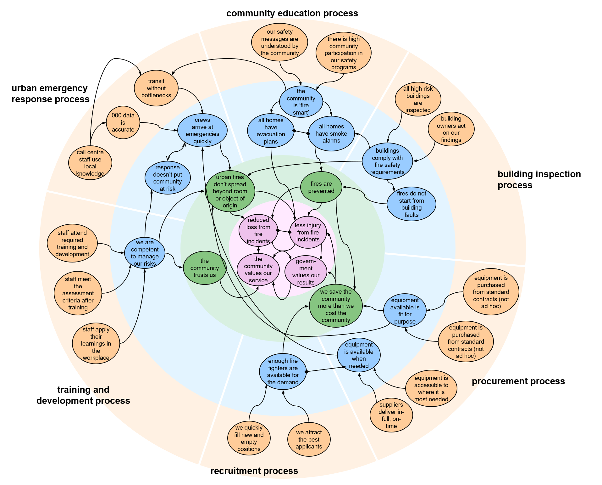
[Click on the image to open a larger version, to follow as you continue to read about the anatomy of Results Maps.]
Great KPIs or performance measures will collectively tell the story of how the whole is performing – the whole organisation, the whole department, the whole team. To understand the performance of the whole, we need to understand how the most important results relate to one another.
The first part of a Results Map’s anatomy is the layers.
There are four layers, denoted by colours. In the Results Map for the Fire Department above, we can see an orange layer around the outside, then, moving toward the middle, a blue layer, a green layer, and finally a pink layer in the centre.
Each of those layers contains a specific category of information:
- The pink layer is the collection of results that describe the mission and vision, or the purpose, of the organisation. These are the ultimate results that the organisation or business intends to achieve, and they usually change very slowly, if at all, over time. These results might have a 10- or 20-year time frame, or even longer.
- The green layer contains the results implied by the current strategic goals for the organisation or business as a whole. These goals are about what needs to improve overall for the organisation to better fulfil its mission and move closer to the vision. These goals will have a two- to five-year time frame. They will change as the organisation grows its capability and new improvement priorities emerge.
- The blue layer contains the most important goals for business processes, such as the maintenance process, the customer delivery process, the marketing process, or a procurement process. If an organisation is not process-oriented, then the blue layer will contain the most important goals for the organisation’s main functions, like human resources, operations, or marketing. Either way, the blue results are about what needs to improve for the organisation to achieve the green results. Results in the blue layer will have a one- to two-year time frame.
- The orange layer contains results that are specific to parts of business processes or business units within the main functions of the organisation. These results are about what needs to improve at a specific operational level in order to achieve the blue results. Results in the orange layer can have a time frame of a few months to a year or so.
The second part of a Results Map’s anatomy is made up of ‘bubbles’.
The bubbles are colour-matched to, and positioned within, each of the four layers. Each bubble contains a specific performance result. These performance results describe the intent of each goal in the organisation in measurable language.
Goals are often written too vaguely and weasely to be understood or to be measured. So their true intent is derived from the PuMP Measurability Tests technique (a shortened version is here). And the product is performance results, that say more clearly what our goals really mean. And that makes them measurable.
The third part of a Results Map’s anatomy comprises the lines that connect the bubbles to one another.
These lines are customized to represent the relationship types I mentioned earlier: cause-effect, companion, or conflict.
- The cause-effect relationship is depicted by a line with an arrow, starting at the cause and pointing to the effect. In the fire department’s Results Map, the green result of ‘fires are prevented’ has a cause-effect relationship to the pink result of ‘less injury from fire incidents’.
- The companion relationship is depicted by a line with a solid dot on both ends that I like to think of as holding the two results together. There is a companion relationship between ‘enough fire fighters are available for the demand’ and ‘equipment is available when needed’ in the fire department’s Results Map.
- The conflict relationship is depicted by a line with an arrow on both ends, but a different style of arrow from that used for the cause-effect arrows. In the fire department’s Results Map there is a conflict relationship between ‘crews arrive at emergencies quickly’ and ‘response doesn’t put the community at risk’.
There are several unique benefits that a Results Map offers, that other strategy mapping tools do not.
Balanced Scorecard Strategy Mapping doesn’t put enough emphasis on writing goals (strategic objectives, in its language) that are measurable. It forces goals into relationships that don’t feel natural to everyone (its four perspectives). And it doesn’t make it easy to see a clear line of sight from operational teams’ goals to the strategic goals.
Logic models don’t always emphasise measurable goal writing, either. And while they map logical relationships between goals, they are often focused only on the linear logic for a single program or outcome.The link to strategy is not always clear, either.
The PuMP Results Map might seem more complex to look at, but the overwhelming majority of people understand it in a matter of seconds. For the first time, they see how they fit within and contribute to the purpose of the organisation. This clarity creates ownership and engagement like you’ve never seen before.
The PuMP Results Map is the best foundation to measure what matters organisation-wide: meaningfully, logically, and systemically.
[tweet this]
DISCUSSION:
What are your experiences with the PuMP Results Map, or any other strategy mapping tool?
Join Measure Up
Sign up for the Measure Up newsletter and get free access to the "10 Secrets to KPI Success" online course and e-book.

Upcoming KPI Training
>> North America, Online Interactive, 15-19 April 2024
>> Australia/NZ/Asia Pacific, Wellington NZ, 7-9 May 2024
>> Africa, Cape Town SA, 8-10 May 2024
>> UK & Europe, Online Interactive, 10-14 June 2024
>> North America, Online Interactive, 3-7 June 2024


Connect with Stacey
Haven’t found what you’re looking for? Want more information? Fill out the form below and I’ll get in touch with you as soon as possible.
167 Eagle Street,
Brisbane Qld 4000,
Australia
ACN: 129953635
Director: Stacey Barr