Why Driving a Car is the Wrong Metaphor for Business Dashboards
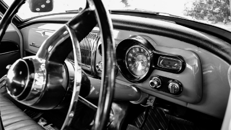
by Stacey Barr |Business dashboard design is based on the metaphor of driving a car: dials, gauges, traffic lights, rear-view mirrors. But there is a huge fault with this metaphor that is driving business performance in reverse (pardon the pun).

Are you as bored with the driving metaphor in performance measurement as I am? Metaphors are brilliant if we choose the right ones, which really do parallel all the important aspects of a concept we’re trying to get people to understand. But if we choose the wrong metaphor, we create misunderstanding. This has happened with the driving metaphor. It has spawned clichés like these (as you well know):
- you can’t drive business performance by looking in the rear-view mirror
- dials and gauges from a car dashboard used in a performance dashboard
- traffic light colours used to flag acceptable or unacceptable performance results
It continues to dominate the performance dashboard landscape, despite warnings and evidence-based alternatives from thought leaders like Stephen Few and Donald Wheeler. Stephen Few, for example, has written about how we’ve taken the car driving metaphor too far in dashboard design. But there is a more fundamental fault with using car driving as a metaphor for monitoring business performance:
Business performance is about change through time.
Driving a car is about changes in time.
Consequently, there are some parts of the car driving metaphor that simply don’t apply to driving business performance:
- Driving a car to a desired destination is almost entirely about looking forward along a chosen route. Driving business performance is largely about understanding the context of current performance, and that requires historic information (looking in the rear-view mirror).
- Driving a car to a desired destination requires only driving skill and a GPS. Driving business performance is complex and multidimensional, with the best route to the desired state usually unknown.
- Driving a car is mostly about maintaining legal speed, healthy engine revs, and sufficient fuel, and keeping the car between the white lines. Driving business performance is inextricably about understanding and reducing variation to improve performance, where the parameters are rarely a given.
- Driving a car is mostly affected by our own direct inputs, in the moment. Driving business performance is affected by complex system dynamics that unfold over time (like the myriad policies, processes, and projects that enable or constrain what people can or cannot do to influence performance).
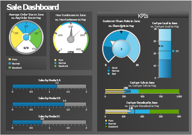
Because dashboard design has been so largely influenced by the car driving metaphor, most of the visualisations in off-the-shelf performance dashboards allow us to make only limited comparisons. Like this dashboard design:

The dials mimic tachometers and speedometers in a car dashboard, and sliders mimic fuel gauges. These help us choose the right gears, apply the right pressure on the accelerator, and avoid running out of fuel, when we’re driving a car. But they only show us a tiny snapshot in time of each KPI, when driving business performance.
Limited comparisons encourage us to tamper with performance. Tampering has been defined by Quality America, and I’ve adapted their definition to the business performance context:
“Tampering with a KPI occurs when we react to a change in KPI values which is not a real change in performance. In other words, it is when we treat any numerical difference between KPI values e.g. between this month and last month, as though it indicates that performance has changed and needs either corrective action (in the case of an undesirable difference) or celebration (in the case of a desirable difference). This is also called “responding to a false alarm,” since a false alarm is when we think that performance has changed when it really has not.”
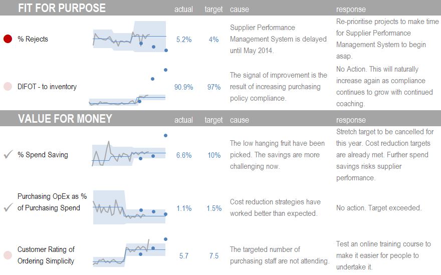
If we could design performance dashboards based on the realities of driving business performance, the layout would be completely different (click for a larger view):
If dashboards were designed like this one, where the focus is on monitoring performance through time (not in time), it would encourage us to fundamentally improve performance. It would be great if we took business performance seriously enough to let the driving metaphor go, once and for all.
Business performance is about change through time. Driving a car is about changes in time. Dials and gauges that work on car dashboards don’t work on business dashboards. [tweet this]
DISCUSSION:
Why do we persist in playing with business dashboards like they are toy cars?
Connect with Stacey
Haven’t found what you’re looking for? Want more information? Fill out the form below and I’ll get in touch with you as soon as possible.
167 Eagle Street,
Brisbane Qld 4000,
Australia
ACN: 129953635
Director: Stacey Barr


