4 Design Principles For Usable Performance Reports
by Stacey Barr |Performance reports that are put together with two font styles – one for the normal text and one for the headings – aren’t just boring and monotonous to the eye. They are also hard to navigate, and make it quite a challenge to find the information you need rapidly and frustration-free.
In a day and age where word processing and spreadsheet software are easy to use and have a plethora of fabulous formatting tools (like colour, typefaces, font sizes, borders, shading and so on), there is really no excuse for not adding a layer of visual information to performance reports to aid navigation and interpretation.
This layer of information could be called “visual prioritisation”, where the most important results are highlighted more strongly to make it easy for the user to prioritise what they read first, and how to interpret it.
A dull layout and formatting design also deadens the interest of users, compels them to put it to the bottom of their reading pile, makes them feel uncomfortable or awkward using the report.
It’s not too hard to learn the basics of good visual design. I learned from Robin Williams (not the actor) in her book called “The Non-Designer’s Design Book” [1]. She discusses four very basic principles of visual design: proximity, alignment, repetition and contrast.
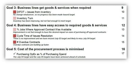
Principle #1: Proximity gives a report structure.
For performance reports, proximity is about the structure of the report and the use of white space to visually “chunk” related information together, such as collating related measures under strategic goal headings.
Principle #2: Alignment gives a report navigatability.
Alignment is about how space on each page or dashboard screen is used so that graphs, explanations, cause analysis and recommendations have obvious connections to one another.

Principle #3: Repetition gives a report familiarity.
Repetition is about consistency, such as using the same graph type and formatting to display performance measures for a trend over time comparison.

Principle #4: Contrast gives a report fast interpretatability.
And contrast is about making the important things really stand out, like signals of sudden or gradual change in performance or the attainment of a target.

Not just useful, but usable too.
Proximity, alignment, repetition and contrast are principles for making your performance reports usable. Of course, the usefulness of a performance report is at least as important as its usability. But without usability, a performance report’s usefulness won’t be discovered!
[1] Robin Williams, “The Non-Designer’s Design Book”, Peachpit Press, 1994
JOIN THE DISCUSSION:
How do you use proximity, alignment, repetition and contrast in the design of your performance reports and dashboards? Share your suggestions on the blog.
Join Measure Up
Sign up for the Measure Up newsletter and get free access to the "10 Secrets to KPI Success" online course and e-book.

Upcoming KPI Training
All our PuMP training options have moved to PuMP Academy.


Connect with Stacey
Haven’t found what you’re looking for? Want more information? Fill out the form below and I’ll get in touch with you as soon as possible.
167 Eagle Street,
Brisbane Qld 4000,
Australia
ACN: 129953635
Director: Stacey Barr