9 Steps to Avoid Analysis Paralysis
by Stacey Barr |When it comes to cause analysis for performance measures, many people put the cart before the horse. They rush too quickly to analyse their data without first establishing a clear purpose.
The purpose of any kind of data analysis is to answer one or more questions.
My framework for getting from questions to answers when you’re doing cause analysis for performance measures has nine steps:
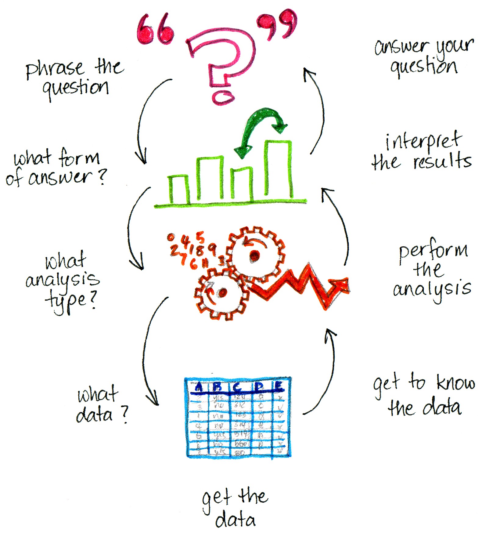
STEP 1: Phrase your question
Write down the question you want to answer and make it as specific as possible. When you’re doing a cause analysis for a particular performance measure, it can help to first brainstorm the factors that might impact that measure and then form one or more questions about each factor. Focus on questions that are useful to answer, not just interesting!
For example, “Do staff with longer tenure cause less rework?” or “Is rework different for different types of tasks?”
STEP 2: What form of answer?
What will you compare with what to answer your question? What are the possible answers to your question and how do you imagine the way this answer would look on paper?
For example, to answer the question about whether staff with longer tenure cause less rework, you want to compare tenure of staff against rework of staff. To answer the question about whether rework is different for different task types, you want to compare the amount of rework for each task type.
STEP 3: What analysis type?
What data analysis process will you need to apply to produce the answer in the form you need it? Do you need a summary, exploratory, explanatory or predictive analysis technique?
For example, an explanatory analysis technique to compare tenure of staff against rework of staff is a regression analysis. An exploratory analysis type to compare the amount of rework for each task type is a Pareto chart or simple bar chart.
STEP 4: What data?
What types of data does your analysis need as an input? List each piece of data you need, its format (eg time on a 12 hour clock versus a 24 hour clock), its value range (eg a scale of 1 to 5), its units (eg centimetres or metres) and its precision (eg dates as month/year versus day/month/year).
For example, the data for a correlation analysis of tenure of staff against rework of staff would be a list of staff members and for each of them a value for their tenure and a value for the rework they generate. The data for a simple bar chart of rework for each task type is a list of the task types and for each of them a value for the total amount of rework generated.
STEP 5: Get the data
Do you have this data already available? Or do you need to collect it? Plan your steps in accessing the data that is available, making sure you understand its degree of integrity. Plan your steps in developing a data collection system for data that you don’t already have.
For example, the data for a correlation analysis of tenure of staff against rework of staff could come from the payroll system and also check sheets where people have recorded the amount of rework generated. The data for a simple bar chart of rework for each task type could come from the check sheets where people have recorded the task type along with the rework generated.
STEP 6: Get to know the data
Bring all of your data together in a place (such as a spreadsheet or database) in preparation for using it. Look over some of the raw data to visually check if it looks okay. Play with some summary statistics like minimum and maximum values, totals and means to check for outliers or potentially erroneous data values.
For example, looking at the minimum and maximum values for staff tenure might reveal that one staff member has 123 years of service, which quite obviously, can’t be right.
STEP 7: Perform the analysis
Apply the analysis you chose, and check over the results to make sure they look plausible. If you find anything funny, go back and check your data integrity. Get help to perform the analysis if you don’t have the confidence or the skills.
For example, create a scatter plot of tenure of staff against rework of staff and get your analysis software (even Excel will do it) to put a regression line or equation on the chart to quantify the relationship. Summarise the data for rework by task type by calculating total rework for each task type and creating a bar chart.
STEP 8: Interpret the results
Translate the output of the analyses into everyday language. Describe clearly the patterns or relationships that the analysis uncovered in your data. Make sure you include information about how reliable those patterns or relationships are, based on your data’s integrity and the kind of analysis you used.
For example, determine if the relationship between staff tenure and staff rework is a strong one or weak one by looking at both the scatter plot’s variability and at the measure of statistical significance, the R2 value. In the bar chart of rework by task type, are there any specific tasks that have significantly more rework than others, or are they all pretty much the same?
STEP 9: Answer your question
Draw conclusions from the interpretations in the context of the question or questions that triggered the analysis. Notice if any new questions surface. If so, go back to step 1 to phrase your new questions.
For example, if you see a strong and statistically significant relationship between staff tenure and staff rework, you’ve answered your original question “Do staff with longer tenure cause less rework?” with a “yes”. A new question might be “Why do staff with shorter tenure cause more rework?” and you’d start the process over again. If you don’t see any particular task type exhibiting more rework than any other, and they all look roughly the same, then you’d answer your original question of “Is rework different for different types of tasks?” with “no”. And you might then phrase some new questions to explore other possible causes of rework, such as “Does time of day impact rework?”
TAKE ACTION:
Do you leave out any of these essential steps to data analysis? If so, create a checklist from these steps to guide you systematically next time you need to use data to answer a business question.
Join Measure Up
Sign up for the Measure Up newsletter and get free access to the "10 Secrets to KPI Success" online course and e-book.

Upcoming KPI Training
All our PuMP training options have moved to PuMP Academy.


Connect with Stacey
Haven’t found what you’re looking for? Want more information? Fill out the form below and I’ll get in touch with you as soon as possible.
167 Eagle Street,
Brisbane Qld 4000,
Australia
ACN: 129953635
Director: Stacey Barr