CASE STUDY: 3 Common Mistakes To Avoid With Your XmR Charts (Part 3)
by Stacey Barr |Following on from Parts 1 and 2, another of the legacy habits that can sneak surreptitiously into our XmR charts and make them incapable of highlighting the real signals in our performance measures, is relying too much on our eyes and not enough on the rules for detecting signals.
In the same way that you can’t hear the music on a radio station when there’s too much static noise, you can’t get clear signals from your performance measures when they have too much static – or what we call chaotic variation.
When you’re using XmR charts, it’s easier to see if your measure has chaotic variation. If you don’t look for the chaotic variation first, then you’re making a big mistake…
MISTAKE #3: Not relying on the proper rules for detecting signals.
Holly is a Corporate Planning Officer in local government. She measures something that most organisations and companies measure: how much sick leave employees are taking. Holly’s measure of this is called Sick Leave Percentage which is the total number of sick leave hours taken divided by the total number of hours worked for full-time employees.
When you look quickly at this measure in a simple time series chart, you might think that nothing much is happening.

But when you look more closely at it, using an XmR chart, there actually is a signal there.
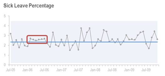
Firstly, though, you might notice a run of six points above the Central Line starting in February 2006. While it’s the easiest pattern to spot in the graph, it’s actually not enough evidence to declare a signal. It stands out to our eye because of the very small variability among these six values.
The next pattern that will pop out from the chart, at least for those of us who have some familiarity with XmR charts, is the eight points in a row that are above the Central Line, starting at November 2008.
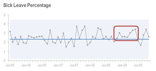
This is the most commonly remembered XmR chart rule for a long run signal. Often I’ll use just seven points in a row, but XmR chart guru Donald Wheeler states eight in a row (over my career I’ve seen anywhere from six to eight being recommended).
Holly saw this signal and recalculated the Central Line and Natural Process Limits accordingly, and appropriately for that particular signal type. But then she didn’t know what to think:
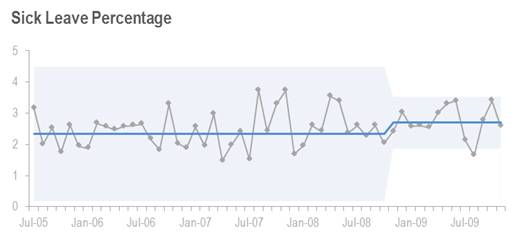
It appears now that things have gone out of control: there are quite a few values of Sick Leave Percentage close to the Natural Process Limits, and one even falls outside. The problem is that Holly missed something.
Those first two patterns are easy for our eyes to quickly see. The first run of six values was not enough to be a real signal of any change in Sick Leave Percentage. And while the second pattern we could easily see is a real signal, it’s not the first signal that appears in this measure.
To see the first real signal that appears, you need to know your XmR chart rules quite well. Starting from February 2008, there are 10 out of 12 points in a row above the Central Line.
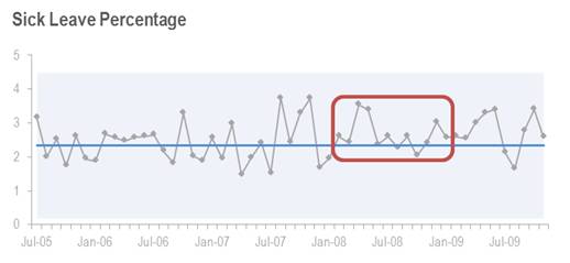
That’s one of the XmR chart rules for a long run signal, and it means we should recalculate the Central Line and Natural Process Limits at the start of that run. Here’s what happens when we do:
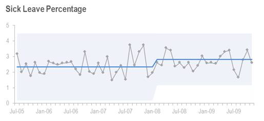
We see the evidence that Sick Leave Percentage has increased, on average, from 2.3 to 2.8. Now, when the right conclusions are drawn from the measure, I’m sure we’re all asking the same questions: what caused this increase and what could have been done about it?
TAKE ACTION:
In response to writing this series of three XmR chart case studies, many people have emailed with specific questions about how to create XmR charts, how to interpret them and how to do the recalculations after signals.
If you’re serious about using this tool to amp up the power of your performance measurement, then the best suggestion I can make is to use one of the following resources to learn how to do it properly:
Donald Wheeler’s book “Understanding Variation: The Key to Managing Chaos” at //www.spcpress.com
My online instructional course “How to Get the Truth out of Your KPIs Using Smart Charts” at //www.usingsmartcharts.com/
Join Measure Up
Sign up for the Measure Up newsletter and get free access to the "10 Secrets to KPI Success" online course and e-book.

Upcoming KPI Training
All our PuMP training options have moved to PuMP Academy.


Connect with Stacey
Haven’t found what you’re looking for? Want more information? Fill out the form below and I’ll get in touch with you as soon as possible.
167 Eagle Street,
Brisbane Qld 4000,
Australia
ACN: 129953635
Director: Stacey Barr