How to Build a Bullet Graph the PuMP Way
by Stacey Barr |The world loves Stephen Few’s bullet graph. It’s small, concise and speaks volumes about the comparison between current performance and targeted performance. It’s a prodigious improvement on dashboard gauges. In constructing a bullet graph, however, you have options. Here’s the one I recommend…
Stephen Few’s recommended features of a bullet graph are important for the graph to be meaningful. Let’s do a quick review of them here, but you can get the detail in his beautiful book, Information Dashboard Design.
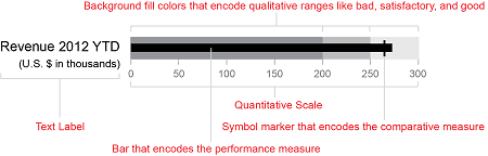
image courtesy of Stephen Few
The anatomy of a basic bullet graph
Firstly, the solid black bar represents your performance measure’s current value.
Secondly, the grey shaded areas depict qualitative ranges of performance. The lighter the shade, the better performance is. So the shaded range that the end of the measure value bar stops in will represent how good or bad performance is right now.
Thirdly, the small black vertical bar or marker, residing in the lightest grey range, is the value of a comparative measure. This usually is the measure’s target.
Here’s a caveat: this basic bullet graph design requires that your measure’s scale starts from zero. This way, the length of the bar in the bullet graph will represent the size of your measure’s value. It also makes sure that the distance between your measure’s value and the target, the symbol marker that encodes the comparative measure, is proportionally correct. That means that you can see how far current performance is from where you want it to be.
Now, Stephen was not particularly prescriptive about exactly how you decide what values the bar and the shaded ranges should be based on. But I am!
I want to give you a prescription, because most people will use the measure’s current month value for the bar, and set arbitrary ranges for the shading. This is not a robust way to assess performance, because it ignores natural variability in the measure’s values. Here is a better way…
A prescription for how to decide what values to use to build your bullet graph
Here is Stephen Few’s bullet graph anatomy diagram again, but this time with my prescription for how to build it:
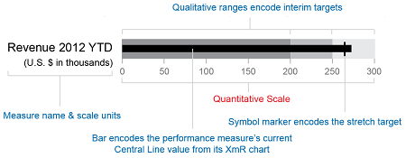
Firstly, the solid black bar encodes the performance measure’s current Central Line value from its XmR chart. If you use the current week’s or month’s value for the measure, you have no idea how much natural variability the measure has, and therefore you don’t get an accurate idea of how far current performance is from the target.
Secondly, the grey shaded areas encode interim targets for the measure’s Central Line. The boundaries between each shaded area are the interim target values. The shaded range that the end of the measure’s bar stops in will indicate that performance has achieved an interim target. I like interim targets, because they help dissolve the debate about whether a target should be stretch, achievable, believable, whatever.
Thirdly, the small black vertical bar or marker is the stretch (or ultimate) target for the measure. This is the level your want your measure’s Central Line – or overall average level of performance – to reach. It doesn’t have to be a stretch target, but you know that once your measure has achieved it, you can turn your attention to other measures that are still progressing toward theirs.
Use these ‘PuMPed’ bullet graphs along with smartlines (or process behaviour sparklines, as Stephen calls them in his book), and you have a very concise, space-saving way to quickly monitor your performance measures.
Special thanks to Stephen Few for his permission to use and his assistance in creating these bullet graph images.
DISCUSSION:
Have you used bullet graphs in your performance dashboards? How have you defined the measure value, qualitative ranges, and comparator?
Join Measure Up
Sign up for the Measure Up newsletter and get free access to the "10 Secrets to KPI Success" online course and e-book.

Upcoming KPI Training
All our PuMP training options have moved to PuMP Academy.


Connect with Stacey
Haven’t found what you’re looking for? Want more information? Fill out the form below and I’ll get in touch with you as soon as possible.
167 Eagle Street,
Brisbane Qld 4000,
Australia
ACN: 129953635
Director: Stacey Barr