Three Things You Need On Every KPI Graph
by Stacey Barr |Do you have these 3 essential things on your KPI graphs in your dashboard? If not, you’re misinterpreting your performance measure signals.
The frighteningly vast majority of performance reports and dashboards are filled with useless graphs or visualisations that fail to communicate the real signals our performance measures and KPIs are desperate to show us.
These reports encourage us to react to trends that aren’t there at all, and to miss important signals about future problems. Misinterpreting our KPIs and performance signals is huge business risk no-one can afford.
We need a revolution in the design of our performance reports and dashboards. A big part of that revolution should be the use of XmR charts, charts that include 3 very powerful features that dramatically improve our interpretation of and response to our performance measures and KPIs.
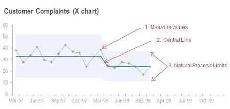
FEATURE 1: Your performance measure in time series
This month compared to last month, this month compared to the same month last year, this month compared to target – all are limited and risky, misleading comparisons to make. Why? Because you have no context within which to assess if the difference you’re looking at is typical or not. There will always be differences, but the only way to see which ones are worthy of your response (or explanation) is to see the data in the full context of a time series.
Plot your performance measures in time series, with as much history as you can reasonably get your hands on. Around 20 values is good, such as the last two years’ worth of monthly values. But you can start an XmR chart with as few as 5 points of your performance measure, if that’s all you have.
FEATURE 2: The measure’s Central Line
The signals of performance lie in the patterns, not the points of data. Two points is not a big enough sample to determine if there’s a change. Adding a Central Line to your time series, calculated from the first 5 or more points and then kept constant, will give you a visual baseline to determine when future points of your measure are behaving differently from the past.
You’re starting to build what’s called an X chart, part of what’s known as an XmR chart. For these charts, there are statistical rules that help you know when a signal is there and when to recalculate a new Central Line. For example, one of the signals of change is a run of 8 points of your performance measure on one side of the Central Line. You can then calculate a new Central Line using those 8 points.
FEATURE 3: The measure’s limits of routine variation
Everything varies. Everything. And performance measure values tend to vary quite a bit, from month to month or week to week or quarter to quarter. Just because one point varies more than 10% from your average, doesn’t mean you have a problem. It depends on how much natural variation is in your measure to start with.
X charts include a measure of the routine variation, known as Natural Process Limits. For example, if a point falls outside the Natural Process Limits on the chart, then you know something has happened out of the ordinary and it’s worth following up. Natural Process Limits also help you pick up signals from only 3 or 4 points of data in a row (you don’t always have to wait for 8 points to behave differently).
BUT: You do need to learn how to use these special charts.
It doesn’t come naturally, and people who don’t take the time to learn make mistakes in constructing and interpreting them. Even highly qualified statisticians! But they’re really easy to learn and VERY worthwhile learning.
The most convincing and clearly articulated resource that I’ve ever seen about using charts like these for management reporting is Donald Wheeler’s book, Understanding Variation: The Key to Managing Chaos. If you consider yourself interested in performance measurement and performance improvement, this book MUST be in your personal toolkit.
If you’re already aware of these powerful XmR charts, and simply want know how to create them, use this XmR chart step-by-step instruction.
TAKE ACTION:
Ratchet up your knowledge on XmR charts for management reporting. Get a copy of “Understanding Variation: The Key to Managing Chaos” and then go find some performance data, and have a go at building XmR chart to reveal the true signals.
This article was updated on 14th February 2014.
Join Measure Up
Sign up for the Measure Up newsletter and get free access to the "10 Secrets to KPI Success" online course and e-book.

Upcoming KPI Training
All our PuMP training options have moved to PuMP Academy.


Connect with Stacey
Haven’t found what you’re looking for? Want more information? Fill out the form below and I’ll get in touch with you as soon as possible.
167 Eagle Street,
Brisbane Qld 4000,
Australia
ACN: 129953635
Director: Stacey Barr