How Many KPI Data Points Do You Need To Use And Interpret Them?
by Stacey BarrThere is a statistically proven sweet spot for how many KPI data points you need before you can start using them and accurately interpreting signals from them.

There are two basic questions that KPIs or performance measures need to answer for us:
- What is the current level of performance?
- Is performance changing?
To answer these questions reliably, we need to make sure we have enough data, or enough KPI values or points, so we don’t jump to the wrong conclusions, or wait too long.
This means finding the sweet spot, just like a cricket bat or tennis racquet or golf club has. It’s the point at which we get the biggest effect from the least effort.
The number of KPI data points matters because of variation.
Variation is the reason why we can’t rely on just one or two points of data to draw conclusions from our KPIs. Dr Donald Wheeler is the world’s foremost expert on understanding variation, and he explains:
“In the mathematical world two plus two is always equal to four. But in this world, in everyday life, two plus two is only equal to four on the average. When you think about this you know that from your own experience that there is variation in everything we do and variation in everything we measure.”
Because variation means that each single KPI value is not a precise measure of reality, we can’t rely on any single KPI value. We need to look at patterns in the values, not at the points themselves.
The minimum number of KPI data points to establish a KPI baseline is five.
A baseline is the collection of points in our KPI that define our starting point, the point from which we want to improve. We need a baseline, because without it we have no starting point, or “before” level of performance, to compare future performance to.
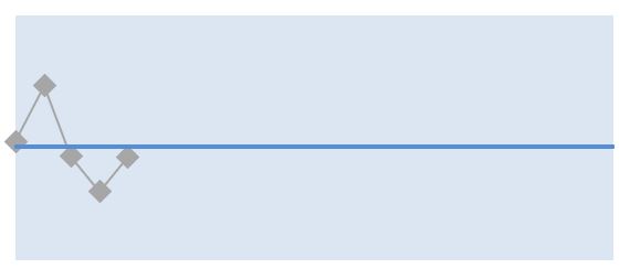
A single point is not a baseline. That’s because of normal variability in anything we measure. Even if you had an identical diet and exercise plan, your weight would still fluctuate from day to day. One day’s weight is not a precise baseline.
We need to use enough performance measure values to calculate the baseline, but not use any more than we need. And the sweet spot is 5 measure values. True; sometimes we need more than that, if the KPI’s variation is a little chaotic. But we can’t use less than five.
The number of KPI data points for an outlier is just one.
An outlier is a single point of data that behaves very abnormally to its neighbouring points of data. It doesn’t mean performance has fundamentally changed; it means that something unusual and rare has happened. Almost always, performance goes back to normal very quickly.
We see outliers very easily in XmR charts, because they fall outside the range of normal variation. We can still see them in line charts, when the outlier ‘lies out’ far enough from the other points. But the XmR chart picks them up instantly and accurately.
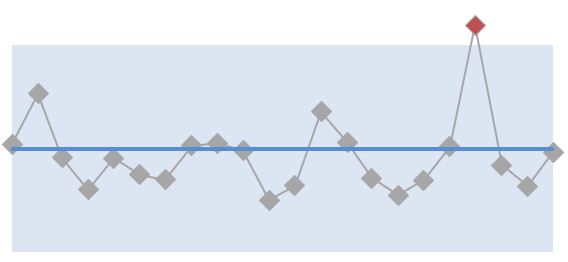
We should never fixate on outliers. It’s useful to find their cause, but also to realise their cause is just a rare or exceptional occurrence and isn’t worth the effort to fix.
The minimum number of KPI data points to declare a small change is eight.
A small change is a shift in performance that moves away from average performance but stays inside the interquartile range (middle 50%) of the spread of normal variability for the measure.
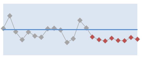
These small changes are called long runs, in XmR chart theory. Because the change is small, we need a bit more convincing that it’s real. And that’s why we need at least eight consecutive measure values to declare a small change in performance.
The minimum number of KPI data points to declare a big change is three.
A big changes is a shift in performance that moves away from the average performance, and also outside of the interquartile range of the spread of normal variability for the measure.
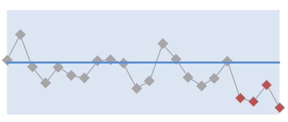
We call these big changes short runs, in XmR chart theory. A bigger change needs fewer points than a small change to convince us. In fact, we can use as few as three consecutive points (or three out of four consecutive points) to declare a big change in performance.
The minimum number of data points to establish a new baseline is five.
When we get a real change in our KPI’s performance, it’s time to create a new baseline. Both a long run signal and a short run signal mean that performance of our KPI has changed. So if we want to see future signals, we need a fresh baseline. And we calculate it using the first five KPI data points from the start of the signal we detected.
This detailed instruction for creating XmR charts will guide you through how to set up your KPIs or measures this way. If you do this with historic data, you might be surprised to see signals you never knew were there. Or to see a correlation between specific events or initiatives and those signals.
“I can’t wait that long!!!”
Do we really have to wait until we have five KPI values before we can start using the KPI? Do we really have to wait for eight KPI values to behave differently, to be sure performance has changed? Yes. We do.
If we don’t, we’re guessing, assuming and knee-jerk reacting. We’re wasting organisational resources on action that isn’t needed, or isn’t likely going to work. We cannot escape the fact that bad decisions are made from insufficient data.
If this means that you’re freaking out because you have to wait for five years of annual survey data before your Employee Engagement measure can be used, it means you’ve chosen the wrong cadence for your KPI.
Caveat: there are always exceptions to any rule.
Chaotic performance is one case where the above rules don’t really work. Our KPI or measure needs to have stable and predictable performance, even with variation, before we can pull out signals. Chaotic variation is usually a sign that the business process being measured isn’t in control. For example, it doesn’t have standard procedures, or the procedures just aren’t followed.
And another case where the above rules are not enough is when we have more complex changes in performance. This might be signals embedded within signals (like outliers embedded in a long run) or trend patterns. And for this, we need extra signal detection rules.
My advice is that we first master the above beginner’s guide to using just enough data to draw conclusions from KPIs. Then we can move onto more complex signal rules. The basic ones will cover most situations, in any case.
Like a golf club, there is a sweet spot for how many KPI values we need to accurately hit its interpretation.
[tweet this]
DISCUSSION:
What are the rules your organisation follows for the number of KPI values to use in drawing conclusions about current performance and changes in performance? Where did the rules come from?
Join Measure Up
Sign up for the Measure Up newsletter and get free access to the "10 Secrets to KPI Success" online course and e-book.

Upcoming KPI Training
>> Australia/NZ/Asia Pacific, Wellington NZ, 7-9 May 2024
>> Africa, Cape Town SA, 8-10 May 2024
>> UK & Europe, Online Interactive, 10-14 June 2024
>> North America, Online Interactive, 3-7 June 2024
>> USA, Washington DC, 25-27 June 2024


Connect with Stacey
Haven’t found what you’re looking for? Want more information? Fill out the form below and I’ll get in touch with you as soon as possible.
167 Eagle Street,
Brisbane Qld 4000,
Australia
ACN: 129953635
Director: Stacey Barr