Interpreting Signals in Trending KPIs
by Stacey BarrFor KPIs with an underlying trend, regression lines and Excel-computed trend lines are very poor at signal detection – instead use the trending XmR chart.
Some performance measures will have natural trends that are not the product of specific continuous improvement actions, such as:
- Mobile or Cell Phone Network Usage – there are more things we can use our mobile phones for, as technology continues its forward march.
- Non-recyclable Waste – as the world continues to move in the direction of recycling things, the amount of non-recyclable waste will continually decline.
- New Website Visitors – organic search traffic will naturally grow if your content is useful enough.
Take my New Website Visitors measure as an example. Here is a simple line chart of the raw measure values, and you can clearly see their trending nature:
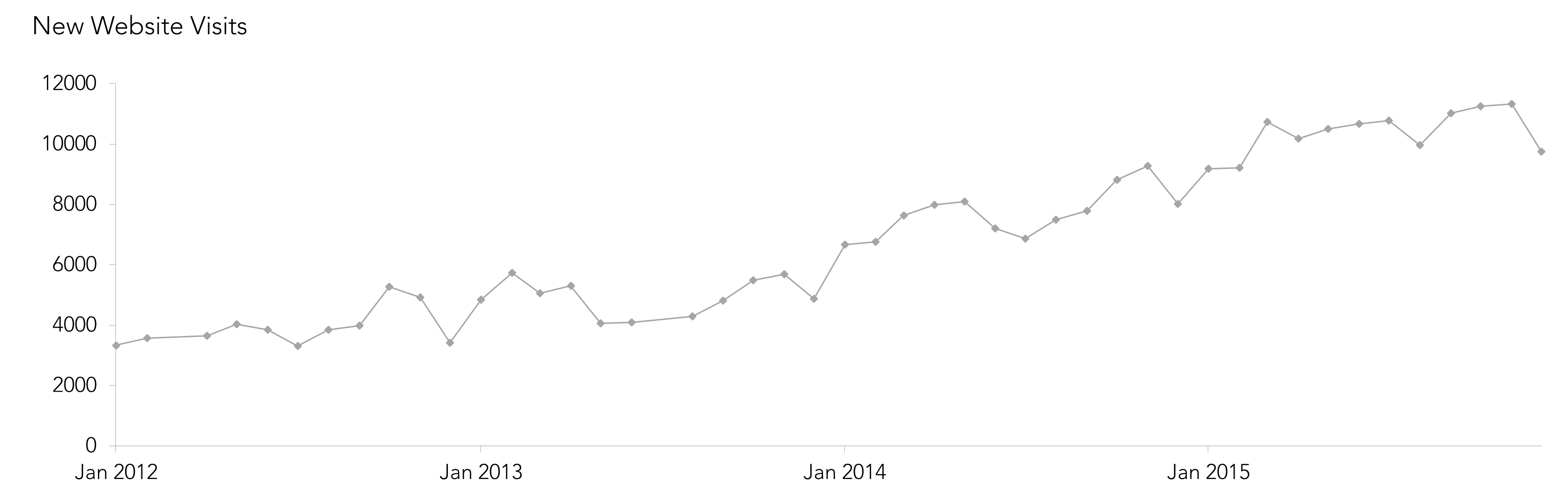
There is a signal in this KPI. Can you see it?
These natural, organic trends not only hide real signals, but can mask the effects of any specific actions we might take to move a KPI or performance measure in a desired direction. Luckily, we can solve this problem. We can pick up true signals of change that are separate to that underlying organic trend. Signals like:
- when the trend is getting shallower or steeper
- when the trend is over, and it’s flattened off
- when the trend is changing direction
But we’re not going down the path of traditional KPI trend analysis!
The trending XmR chart makes the signals clear.
The XmR chart (in PuMP we nickname it the Smart Chart) needs only a slight adaptation to highlight signals in trending KPIs. We create a trending Central Line and trending Natural Process Limits which follow the underlying trend in the performance measure.
But don’t jump the conclusion that we’ll be using Excel to calculate and add a trend line through our measure values. In addition, we are not de-trending our measure values, like we do in the case where our KPI is seasonal or cyclical. Rather, we’ll be using Donald Wheeler’s technique, described in chapter 12 of his book “Making Sense of Data“.
How to build a trending XmR chart for trending KPIs.
Firstly, download the spreadsheet template here, if you want to follow along with my New Website Visits measure, or build your own trending XmR chart for your trending KPI.
In a few steps, the approach goes like this:
- Collate the measure values and confirm there is a trend.
- Calculate the trending factors.
- Calculate the trending Central Line and Natural Process Limits.
- Construct the trending XmR chart and look for signals.
- If there’s a signal, recalculate the Central Line and Natural Process Limits to match the change.
STEP 1: Collate the dates and performance measure values.
We need at least a dozen performance measure values to calculate a trend Central Line and Natural Process Limits. That said, we need at least that many anyway to determine that we really do have a real trending KPI.
For my New Website Visits measure, I clearly have enough historic data to conclude there is a convincing underlying trend.
STEP 2: Calculate the trending factors.
There will be two calculations we need to make our new Central Line and Natural Process Limits follow the underlying trend in our KPI.
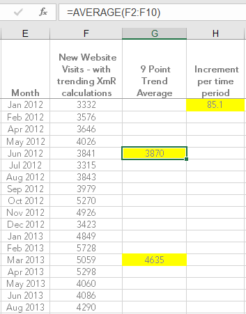
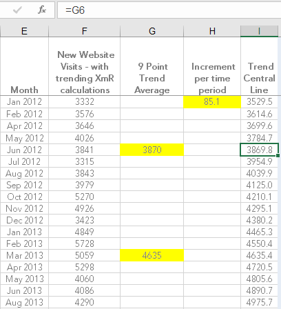
First, we calculate the half-averages. These come from taking the average of the first 5 to 9 points, and also the average of the second 5 to 9 points, in our measure’s series of values. For New Website Visits, I’ve chosen 9 points (in part because I have enough historic data to do that, and I saw in the earlier chart that the trend is present for quite some time):
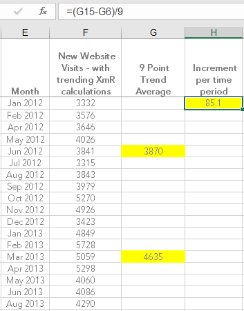
Second, we calculate the increment per time period to trend the Central Line. It goes like this:
( [second half-average] – [first half-average] ) / [Number of points between them]
In the New Website Visits example, the calculation would look like this:
[4635] – [3870] / 9 = 85.1
The increment per time period will be used to compute the values that will draw the trend Central Line.
STEP 3: Calculate the trending Central Line and Natural Process Limits.
Starting with the first half-average, we set the Central Line value to equal that value.
Then, we work backwards to compute the first values for the trend Central Line by successively taking away the increment per time period.
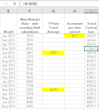
Then again starting with the first half-average, we work forward to compute the remaining values for the trend Central Line by successively adding the increment per time period.
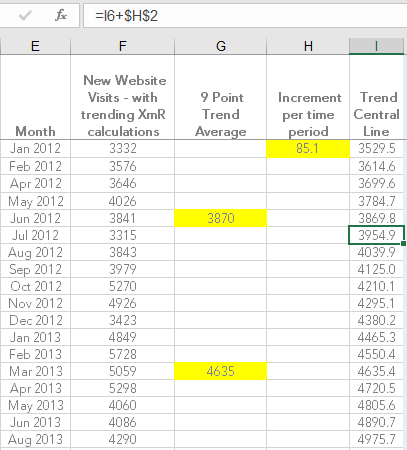
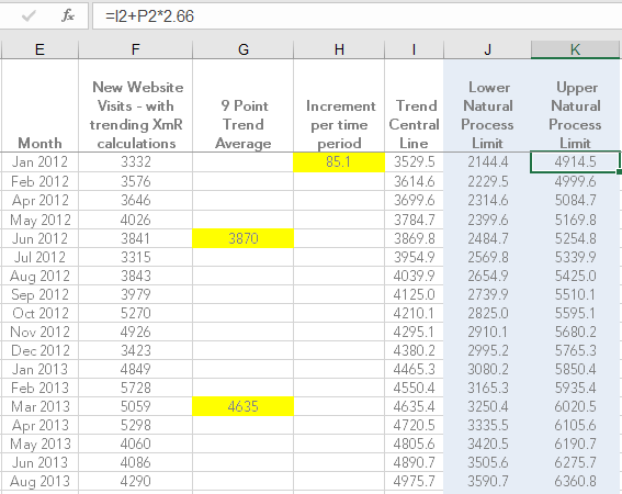
The Natural Process Limits will be calculated the same way they are for a normal XmR chart. But because the Central Line is trending, and the formula for the Natural Process Limits is based on the Central Line, they will automatically trend as well.
If you’ve downloaded the trending XmR chart template, then you can dive into each cell to see how the calculations are done, in more detail.
STEP 4: Construct the trending XmR chart and look for signals.
We build the XmR chart the same way we build a normal one. The difference we’ll notice though, is that the Central Line and Natural Process Limits will be sloped, following the organic trend in our KPI. Here’s just the X chart from the New Website Visits XmR (in the download spreadsheet, you can see the
XmR chart also):
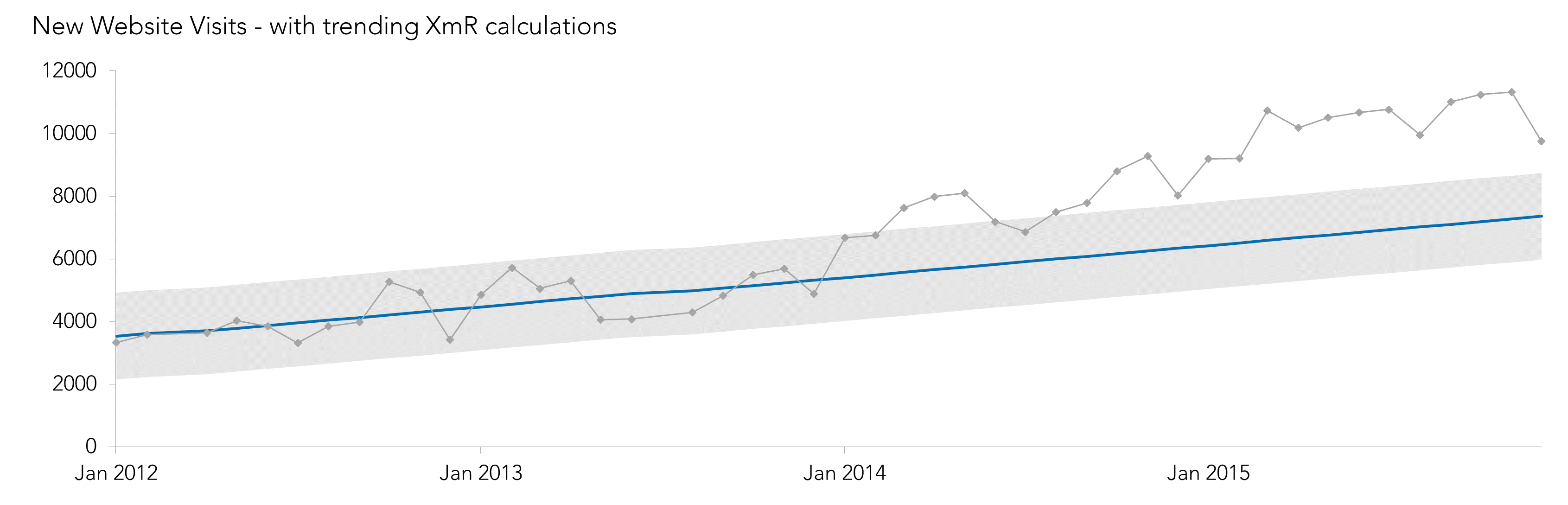
Can you see the signal now?
This signal is known as a short run (it’s one of the 3 essential
signals to look for in a KPI and these signals still apply to trending XmR charts). It indicates an increase in the trend of New Website Visits. In other words, the growth in new visitors to my website got faster. This was just after I began licensing PuMP to a few consultants around the world, and people in their networks began visiting my website.
STEP 5: If there’s a signal, recalculate the Central Line and Natural Process Limits to match the change.
If we find a signal it means that performance has changed, and we need a new baseline for future signal detection. We now need to compute the new trending Central Line and Natural Process Limits.
To do this, we have to wait until we have at least 10 points, 5 for the first half-average and 5 for the second half-average. I chose to continue using sub-groups of 9 points for my New Website Visits measure.
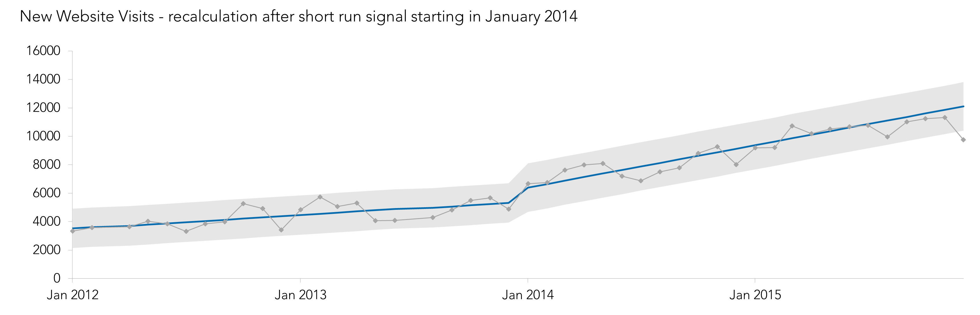
Beware that the trend may not continue at the same rate, or at all. Especially for downward trending KPIs. We may even find that it is more sensible to go back to the standard horizontal calculations for the Central Line. But that’s not the case for New Website Visits (which I’ll demonstrate in another Measure Up post soon).
Why don’t we just use regression-style trend lines?
As commonly used as they are, regression lines and Excel-computed trend lines are far inferior to the trending XmR chart.
“Regression is the accepted approach for fitting a line to the data in a scatterplot where one variable, Y, is thought to be dependent upon the other variable, X. But here this is no sense in which these trends [in measures over time] depend upon the time period. The relationships are not cause-and-effect, but rather coincidental.”
Donald Wheeler, “Making Sense of Data”
We don’t want an overall, smoothed out, long-term summary of the trend in our KPIs. We need to know when patterns in the trend change, why they change, and how big the change is if it’s due to an action we took.
So, download the trending XmR spreadsheet template here, and try it out on one of your trending KPIs. If you find some interesting signals, let us know in the comments below this blog post.
To detect signals in KPIs with an underlying trend, regression lines and Excel-computed trend lines are far inferior to the trending XmR chart. [tweet this]
Join Measure Up
Sign up for the Measure Up newsletter and get free access to the "10 Secrets to KPI Success" online course and e-book.

Upcoming KPI Training
All our PuMP training options have moved to PuMP Academy.


Connect with Stacey
Haven’t found what you’re looking for? Want more information? Fill out the form below and I’ll get in touch with you as soon as possible.
167 Eagle Street,
Brisbane Qld 4000,
Australia
ACN: 129953635
Director: Stacey Barr