Bullet Graphs or Smartlines – Which One is Best?
by Stacey Barr |I’ve written about two very powerful graphs to use on performance dashboards, or in performance reports that need to be concise: my version of Stephen Few’s bullet graph, and my version of Edward Tufte’s sparkline (my version is called a smartline). Is one better than the other?
It’s not a matter of deciding which one to use, but rather why you’d use both.
Smartlines tell you the time, type and direction of a real change in performance.

Smartcharts can do this because they use the two powerful features of XmR charts. The first powerful feature of the XmR chart is the central line, and this line is roughly the equivalent of the overall current level of performance.
The second powerful feature of the XmR chart is the natural process limits, which tell you how much routine or natural variability your measure has, and therefore which period-to-period fluctuations you can ignore because they’re just routine variation.
With smartlines, you can apply a set of statistically valid rules to detect when performance has changed. So these little charts pack a lot of interpretation power into a small space. At a glance you can see if performance is changing, in what direction it’s changing, and when that change was triggered.
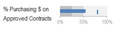
Bullet graphs give you a comparable snapshot of how far current performance is from to-be performance.
The smartline won’t tell you how far current performance is from to-be performance, because it wants your attention on what’s happening through time, rather than on the magnitude of difference between current performance and your targets. So the scaling of the vertical axis in a smartline is not based at zero, it’s designed so the chart data fills the available chart space.
At a glance, your bullet graph will tell you how far current performance is from where it should be or where you want it to be.
So when you use both bullet graphs and smartlines together, you get a very comprehensive answer to one of the most important questions you should ask of every performance measure: What is performance actually doing?
You can, at a glance, know:
- is performance changing, or staying the same?
- if it’s changing, is it changing for the better or the worse?
- if it’s changing, when did the change begin?
- is current performance improving at the rate it should to reach our targets?
The performance measure Purchasing $ on Approved Contracts measures the percentage of a company’s total expenses that are made via contracts with approved suppliers. Bringing the smartline and bullet graph together we can describe a fuller story about what performance is actually doing:
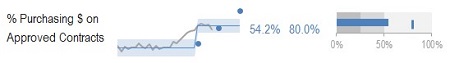
The smartline tells us that recently there was a dramatic upward shift in the measure, which moved it well beyond its two interim targets. And then the bullet graph adds more to the story by showing the actual size of the gap between performance now, and the stretch target of 80%.
DISCUSSION:
For the first five people who respond in the comments on the blog, you can send me the data and target for one of your performance measures, and I’ll create a smartline and bullet graph for you, and write a blog post about the story your measure wants to share.
Join Measure Up
Sign up for the Measure Up newsletter and get free access to the "10 Secrets to KPI Success" online course and e-book.

Upcoming KPI Training
All our PuMP training options have moved to PuMP Academy.


Connect with Stacey
Haven’t found what you’re looking for? Want more information? Fill out the form below and I’ll get in touch with you as soon as possible.
167 Eagle Street,
Brisbane Qld 4000,
Australia
ACN: 129953635
Director: Stacey Barr