CASE STUDY: 3 Common Mistakes to Avoid With Your XmR Charts (Part 1)
by Stacey Barr |Some legacy habits with how we analyse our data often sneak surreptitiously into our XmR charts, and these habits make our XmR charts incapable of highlighting the real signals in our performance measures.
XmR charts are based on very specific and deliberate statistical theory, even though they are quite easy to interpret and understand. They are quite easy to create also, when you have the correct knowledge and procedure to build them.
Without this correct knowledge and procedure, a few mistakes creep into our XmR charts that cause them to be invalid: they don’t highlight the right signals.
MISTAKE #1: Failing to correctly remove seasonal or cyclical effects
Juanita works for an Australian city council that has a performance measure of Total Sick and Carers Leave.
This is calculated from the number of days taken as sick leave or carers leave in the period, divided by the number of employees (or full time equivalents, FTE).
The graph below reports the actual values of this measure for each month.
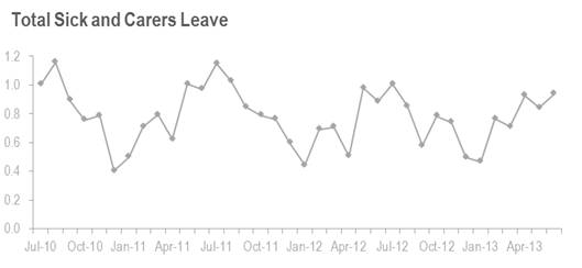
You can see the seasonal effect: high points around the middle of the year and low points around Christmas.
In Australia, the middle of the year is usually big for school holidays and, being winter, it’s also big for people getting sick. You’d expect Total Sick and Carers Leave to be high at this time.
In contrast, Christmas is popular for recreation leave so Total Sick and Carers Leave would naturally be lower.
This seasonal effect makes it hard to work out if Total Sick and Carers Leave is getting better or worse, or not changing at all. We need to remove the seasonal effect to find the real signals.
Using a 12-month moving average is a common way that people deseasonalise data, but it means that the moving average data points have high ‘autocorrelation’. This means that the value of one point is greatly dependent on the value of previous points.
For XmR charts, low autocorrelation is important, so we need another way to remove the seasonal effect from our measures.
Correcting this mistake…
This is the way to deseasonalise data that I learned from Donald Wheeler, the expert I learned XmR charts from. It makes sure that there is little autocorrelation in our measure values.
After we deseasonalise Juanita’s measure values, we can create a valid XmR chart that will highlight the right signals. And here it is:
Now it’s much easier to see the signal! Can you see it?
Identifying the signal from the deseasonalised measure
The signal is called a long run below the central line. It starts at January 2012, where we get a run of 10 points out of 12 in a row below the central line. Isn’t it now obvious to ask what happened in January 2012?
Recalculating the central line and upper and lower natural process limits shows us the size of improvement in the measure of Total Sick and Carers Leave: the central line moved from 0.79 to 0.73. It’s a small improvement, but it’s a real improvement.
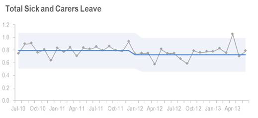
This improvement seemed to hold until October 2012, where we can see another signal, a long run above the central line. What happened in October 2012?
We can also see a special cause signal at April 2013. And of course we’d want to know the reason for that.
Can you see how XmR charts, when done correctly, naturally encourage us to ask the right questions?
Coming up next is 3 Common Mistakes to Avoid With Your XmR Charts (Part 2)…
TAKE ACTION:
If you have a performance measure with a seasonal or cyclical effect in it, then try this method to deseasonalise your measure and then create an XmR chart to discover if you have any signals that everyone has so far missed!
Join Measure Up
Sign up for the Measure Up newsletter and get free access to the "10 Secrets to KPI Success" online course and e-book.

Upcoming KPI Training
>> Australia/NZ/Asia Pacific, Wellington NZ, 7-9 May 2024
>> Africa, Cape Town SA, 8-10 May 2024
>> UK & Europe, Online Interactive, 10-14 June 2024
>> North America, Online Interactive, 3-7 June 2024
>> USA, Washington DC, 25-27 June 2024


Connect with Stacey
Haven’t found what you’re looking for? Want more information? Fill out the form below and I’ll get in touch with you as soon as possible.
167 Eagle Street,
Brisbane Qld 4000,
Australia
ACN: 129953635
Director: Stacey Barr