How to Explain the Value of XmR Charts for KPIs
by Stacey Barr |XmR charts are more complex than line charts for KPIs, and until people understand their true value, they won’t bother. This is how to explain the value of XmR charts.

XmR charts are our preferred KPI visualisation tool in PuMP. Yes, preferred over dials, gauges, line charts, bar charts, pie charts, bullet graphs and sparklines.
But because they aren’t as pretty or as popular, our PuMP community members sometimes find themselves in situations where they have to sell the power of XmR charts. Like Gohar recently shared with me:
“I recently had a conversation with a middle size business owner who quite candidly told me when I showed him an XmR chart, and pointed out to all its capabilities: ‘Yes, I can see what you are saying but quite frankly, isn’t it obvious where we are doing well/not so well just from a line chart? Why do we need this more complex chart for a business like mine?'” – Gohar, PuMP graduate, Spain
Gohar went on to say that she felt her answer could have been more impactful in selling the value of XmR charts to such an important and busy person. And she found herself wondering if a small business (or team) even needs XmR charts to make a difference.
XmR charts are useful for any KPI or performance measure, no matter what size the business or organisation is. And particularly for important and busy people, they are the only way to quickly and accurately, get the truth out of a KPI. Otherwise, we waste time doing what doesn’t need to be done, or not doing what does need to be done (before it’s too late).
To explain why XmR charts are worth the effort (and most of the effort is in learning them, because once set up, they are quick and easy), here are three ways that they are so valuable for KPIs…
XmR charts help us avoid two common errors in using KPIs.
The two common errors we make when we rely on line charts or other simplistic visualisations are:
- We over-react to differences in our measure values that are not caused by real change, but rather caused by natural random variation.
- We under-react to changes in our measures that are small and easily dismissed but are caused by real changes we should know about (before they escalate).
Because line charts and other visualisations don’t show us the natural random variation each of our KPIs have, we fall into the trap of thinking every numerical difference is real (or every difference bigger than some arbitrary cut-off). Statistician and XmR chart guru, Donald Wheeler, explains it well:
“Well, point-to-point comparisons are natural, they are intuitive, but they are slightly naive. It is our interpretation of these comparisons that gets us in trouble. We usually interpret all the changes as signals that need to be explained. The numbers go up and that is a signal. The numbers go down and that is a signal. The numbers stay the same and that is a signal too, because we were expecting them to go up or to go down, you know. Then everything becomes a signal and every signal needs to be explained. Unfortunately, these explanations only need to be plausible, they do not need to have any real contact with reality.” – Donald Wheeler, author “Understanding Variation: The Key to Managing Chaos”
The key to avoiding those two common errors in interpreting our KPIs is to use a visualisation that shows us the difference between natural random variation, and real change. XmR charts are the only visualisation I know that can do this validly.
XmR charts remove the debates about what performance is doing.
For nearly 20 years we’ve run an experiment in our PuMP training workshops that proves just how differently the same KPI can be interpreted by different people. And I’ve seen it very often in executive and management performance meetings.
The experiment shows a real KPI, displayed in a line chart:
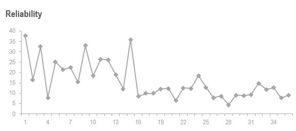
Our PuMP workshop participants will interpret this differently. Some say that it has downward trend. Others say it’s not changing. And a few say it’s starting to increase again. You can imagine also, can’t you, that depending on how much of the history a line chart shows, the interpretation can be different again?
But they’re all wrong. And only the XmR chart shows the truth about this KPI:
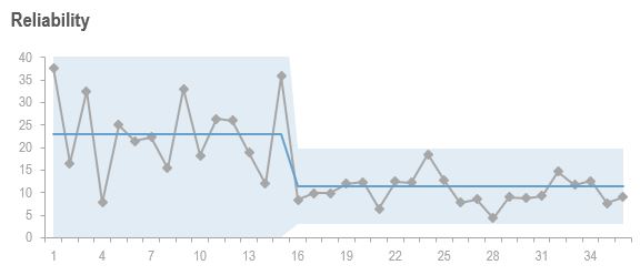
The truth is that there was a sudden change at one point in time, to both the level of performance and the natural variation. Other than that, no other real change in the KPI is evident. And, when everyone saw this sudden change, which the XmR chart makes very obvious, they naturally asked what caused it. And the true story is that the cause was a change in the way the KPI was calculated.
XmR charts make setting and reaching targets easier.
There are several ways that we see targets added to line charts and other common visualisations. They can be straight lines that span the width of the chart. Or threshold ranges coloured like traffic lights. But they beg the question: exactly what are we comparing with the target?
Almost always, people will only compare the most recent measure value with the target. So each month (or reporting period), the current measure value is either above, or below or at the target. And every month (or reporting period), there needs to be an explanation if it’s on the wrong side of the target. This is the same dynamic that Donald Wheeler explained, in the quote above.
XmR charts solve this monthly variation-explanation rollercoaster ride by giving us a performance baseline that’s more valid than the most recent measure value. And that’s what we compare to the target:
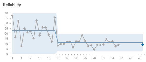
Even though the most recent KPI values for this measure are at the target, the natural variation says it won’t stay that way – the baseline is still above the target.
XmR charts are the simplest way to get the truth from our KPIs.
When we appreciate the limitations of line charts, and other popular visualisations for KPIs, it’s easy to appreciate that XmR charts are not more complex. Rather, XmR charts are the simplest way to get the truth from our measures, without being too simplistic:
“Make everything as simple as possible, but not simpler.” – Albert Einstein
If you are faced with having to sell the value of XmR charts for KPIs, one of the best things you can do is to show that value. Take one of the KPIs, and create an XmR chart for it. Then show it alongside the current visualisation used for that KPI. Then you can more easily talk through the three ways, above, that XmR charts are more valuable.
Join Measure Up
Sign up for the Measure Up newsletter and get free access to the "10 Secrets to KPI Success" online course and e-book.

Upcoming KPI Training
>> Australia/NZ/Asia Pacific, Wellington NZ, 7-9 May 2024
>> Africa, Cape Town SA, 8-10 May 2024
>> UK & Europe, Online Interactive, 10-14 June 2024
>> North America, Online Interactive, 3-7 June 2024
>> USA, Washington DC, 25-27 June 2024


Connect with Stacey
Haven’t found what you’re looking for? Want more information? Fill out the form below and I’ll get in touch with you as soon as possible.
167 Eagle Street,
Brisbane Qld 4000,
Australia
ACN: 129953635
Director: Stacey Barr